5 Trends You Should Expect to See in 2020
1. Minimalism
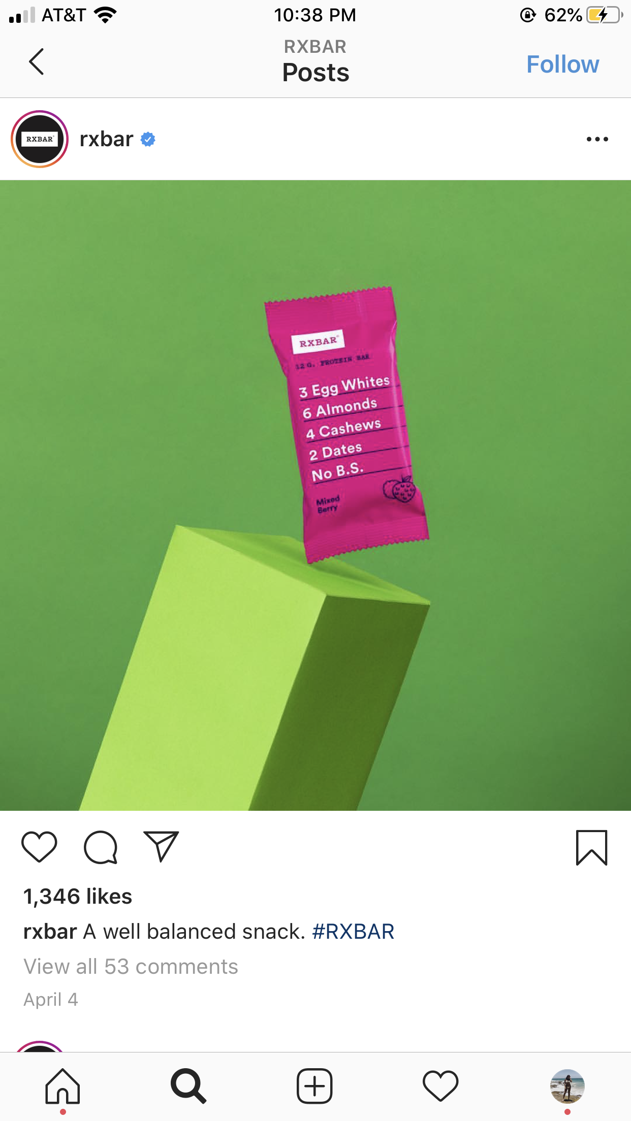
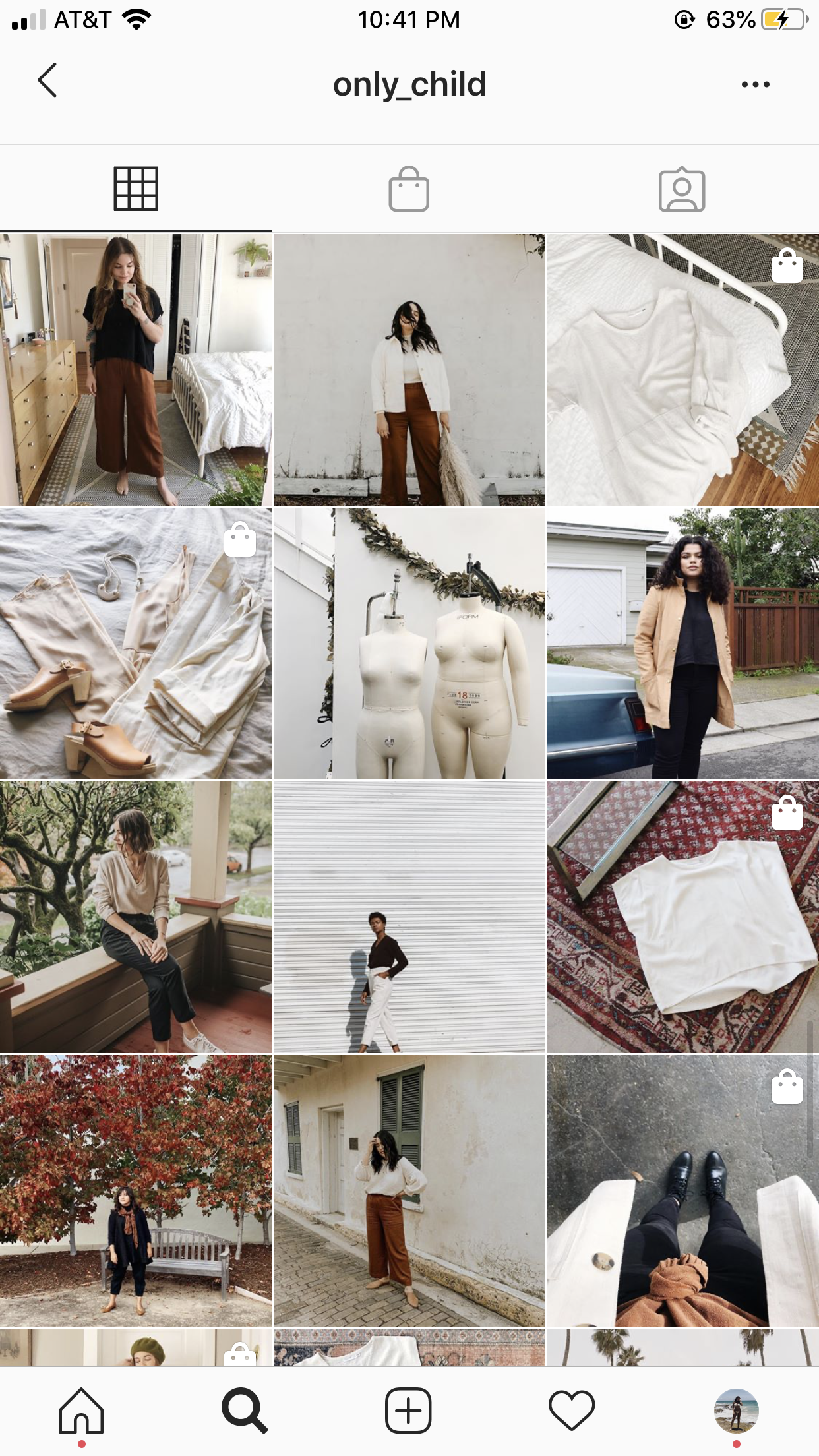
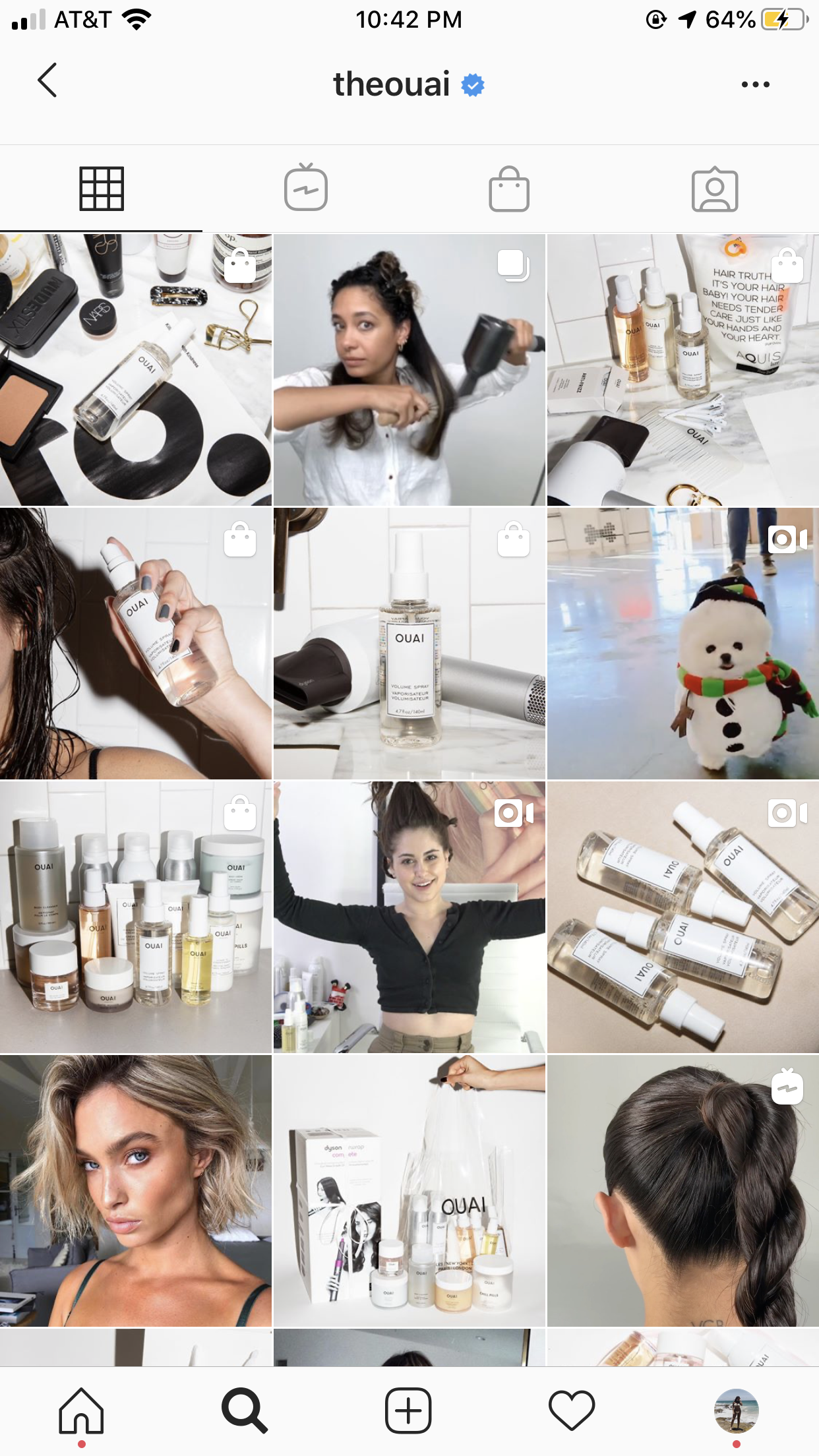
By now, we are all familiar with minimalism. But in 2020, expect this trend to be more prevalent than ever. The main theme of minimalism is to say more by doing less. Minimalist graphic design is sleek, clean and uncluttered. Basically, in 2020 expect to see a shift towards simplicity when it comes to graphic design and social media marketing. Here are a few brands already following this predicted trend well, but in different ways. RXBAR keeps their packaging super minimalistic, just listing their few ingredients along with their logo. They kept the photo simple, using only two colors. Only Child and Ouai kept their feeds minimalistic by sticking to light and specific color scheme. Their feeds are cohesive, not too overwhelming, and easy on the eyes.
2. Muted Color Palettes
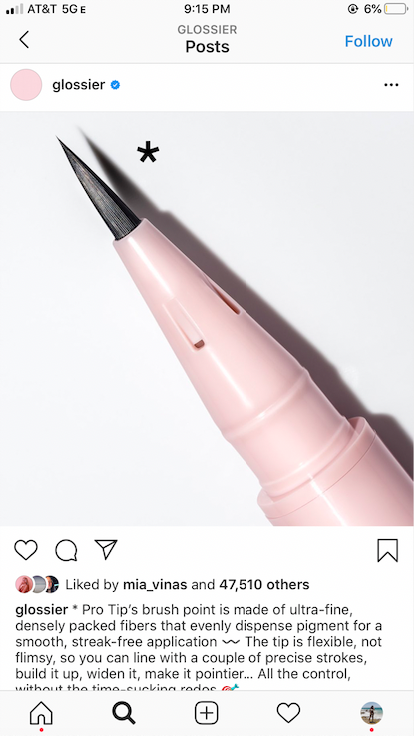
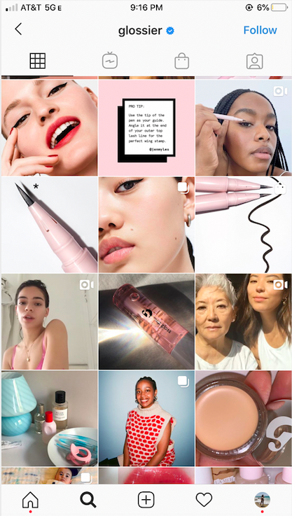
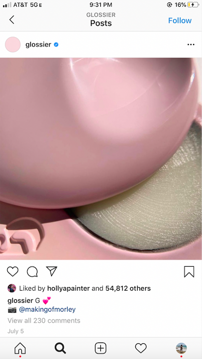
When a color is muted, it means it is low in saturation or brightness (think of the opposite of a vivid color). Incorporating muted colors doesn’t just change the appearance of your social media, but can leave an emotional effect on those who come across your profile. Muted colors are easier to look at and give your page a more relaxed feel. Below is an example of a muted color palette and a brand already hopping on this trend. Glossier focuses on muted pinks to create their cohesive look. Not every post is entirely pink, but if you take a close look you can see most photos incorporate that theme in at least a small way. This approach makes their profile easy on the eyes, relaxing, and easy to scroll through.
3. GIFs and Animation
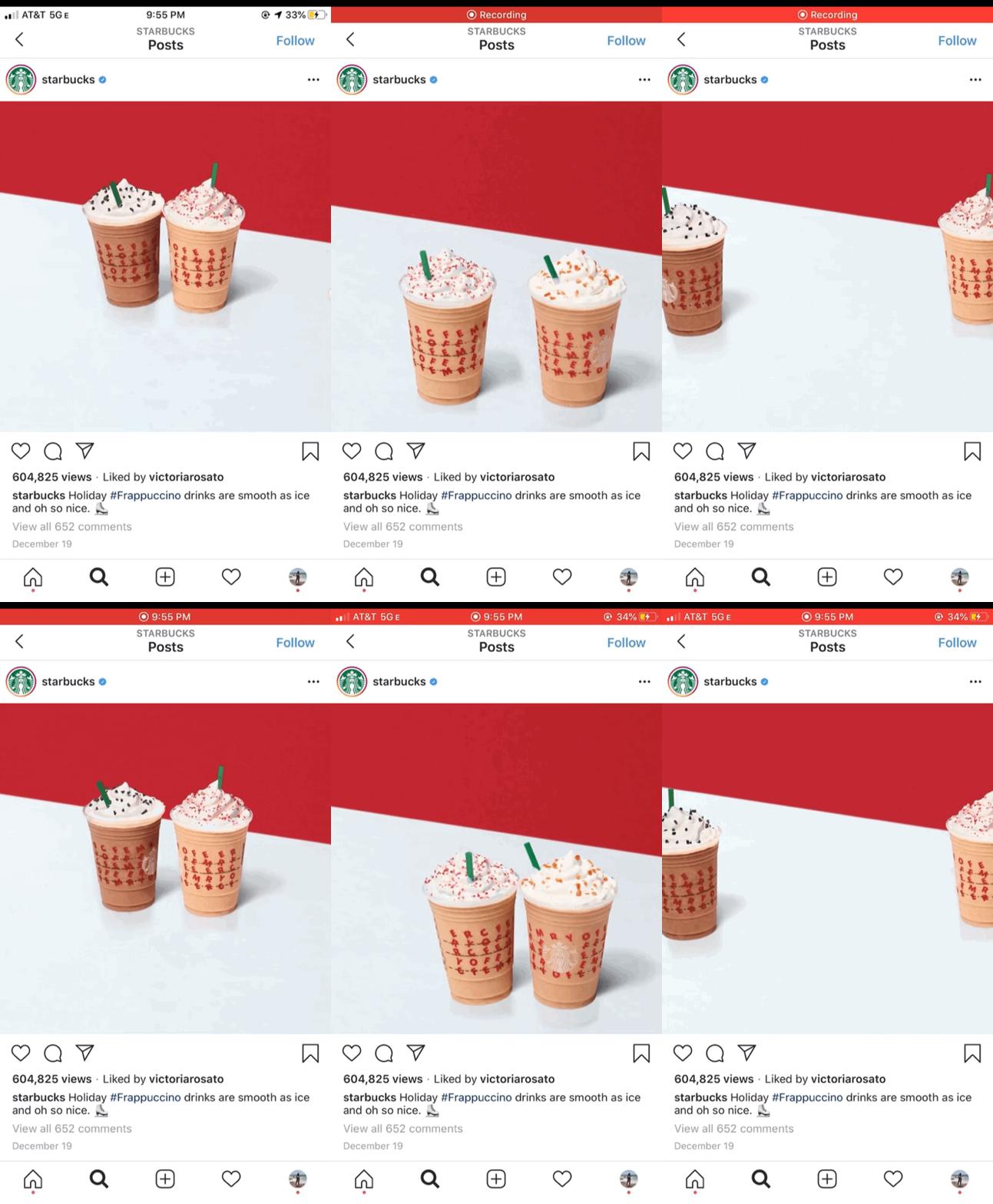
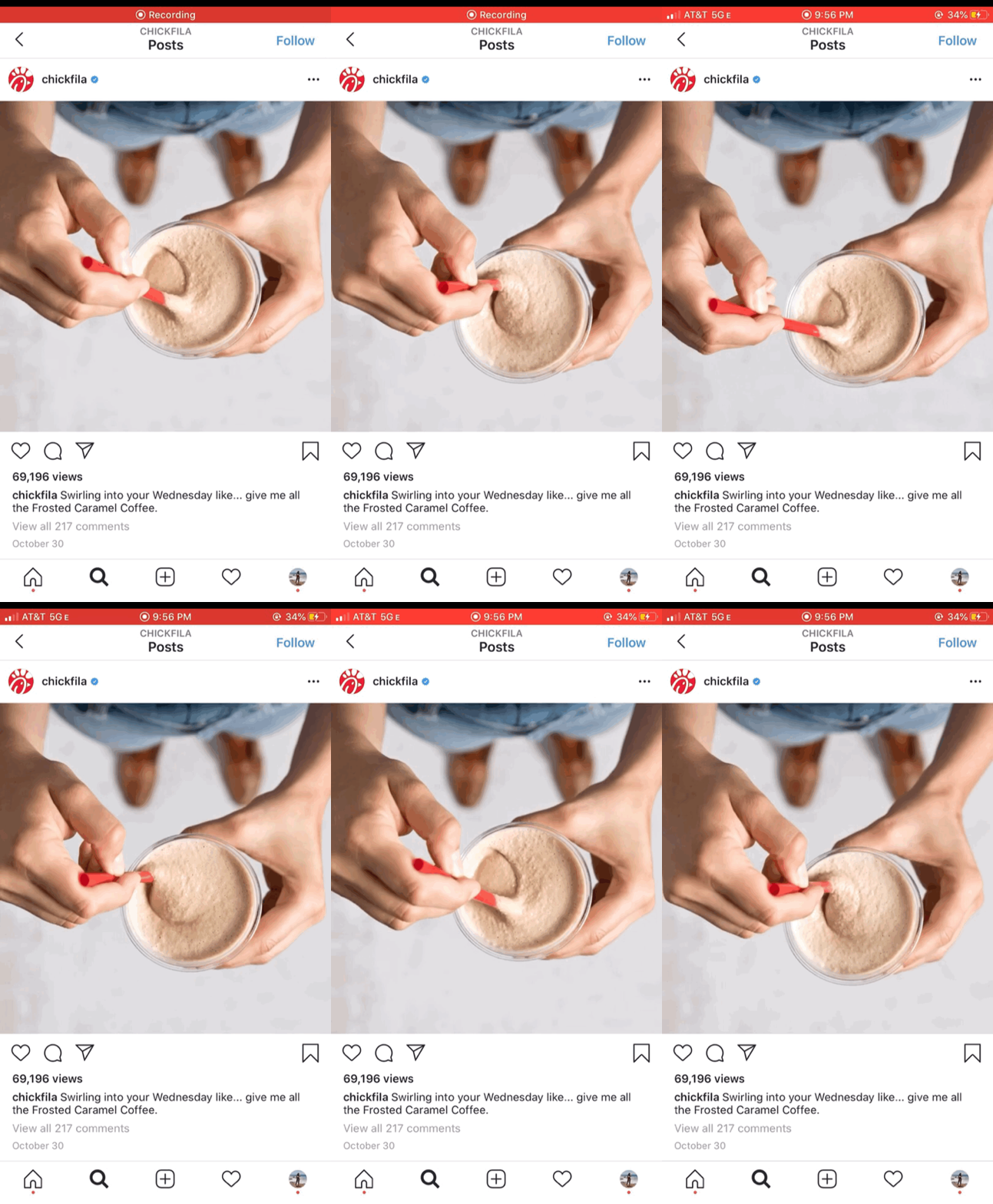
Below are prime examples of a major trend you should expect to see in 2020. Starbucks and Chick-fil-A posted GIFs to promote their blended beverages. The fun animation of the actual products is a great way to promote new products. GIFs are a little more exciting than your average post, and can be a great way to deviate from your normal picture or video post. Trader Joe’s went a little bit of a different route and used animation to promote their products. This post, which is very similar to a GIF, is another alternative to your average post. Step your social media game up by downloading apps that make creating graphics like these easy.
4. Monochrome
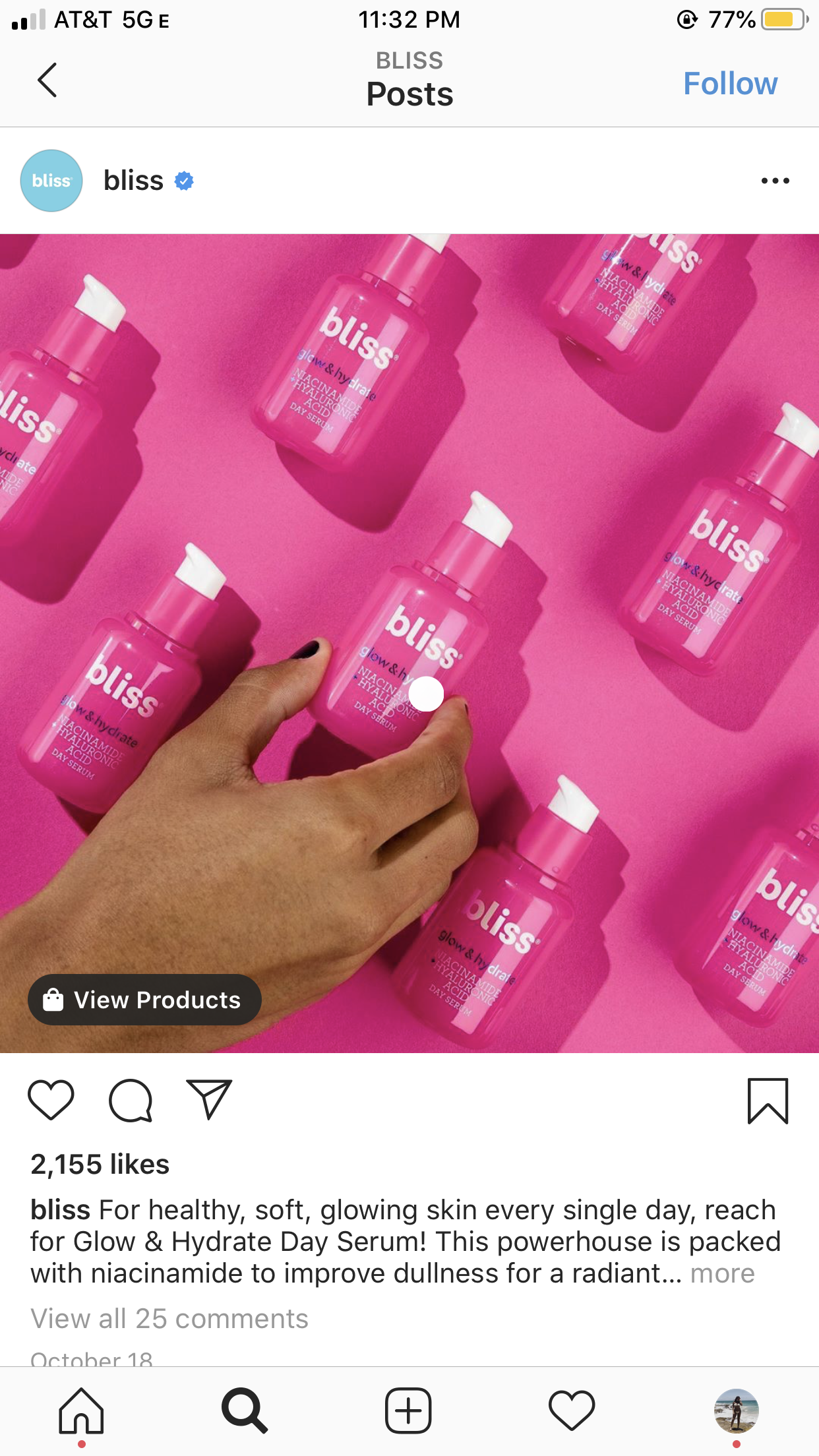
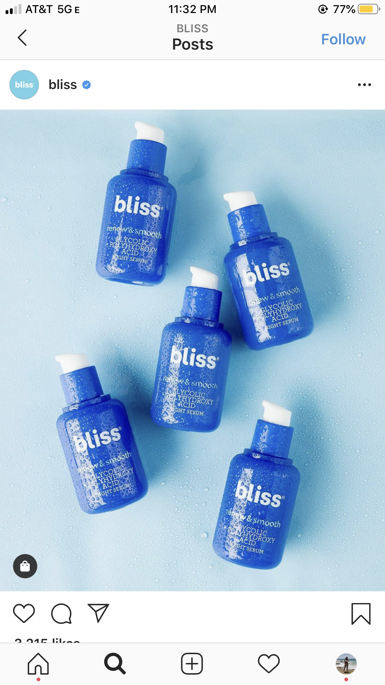
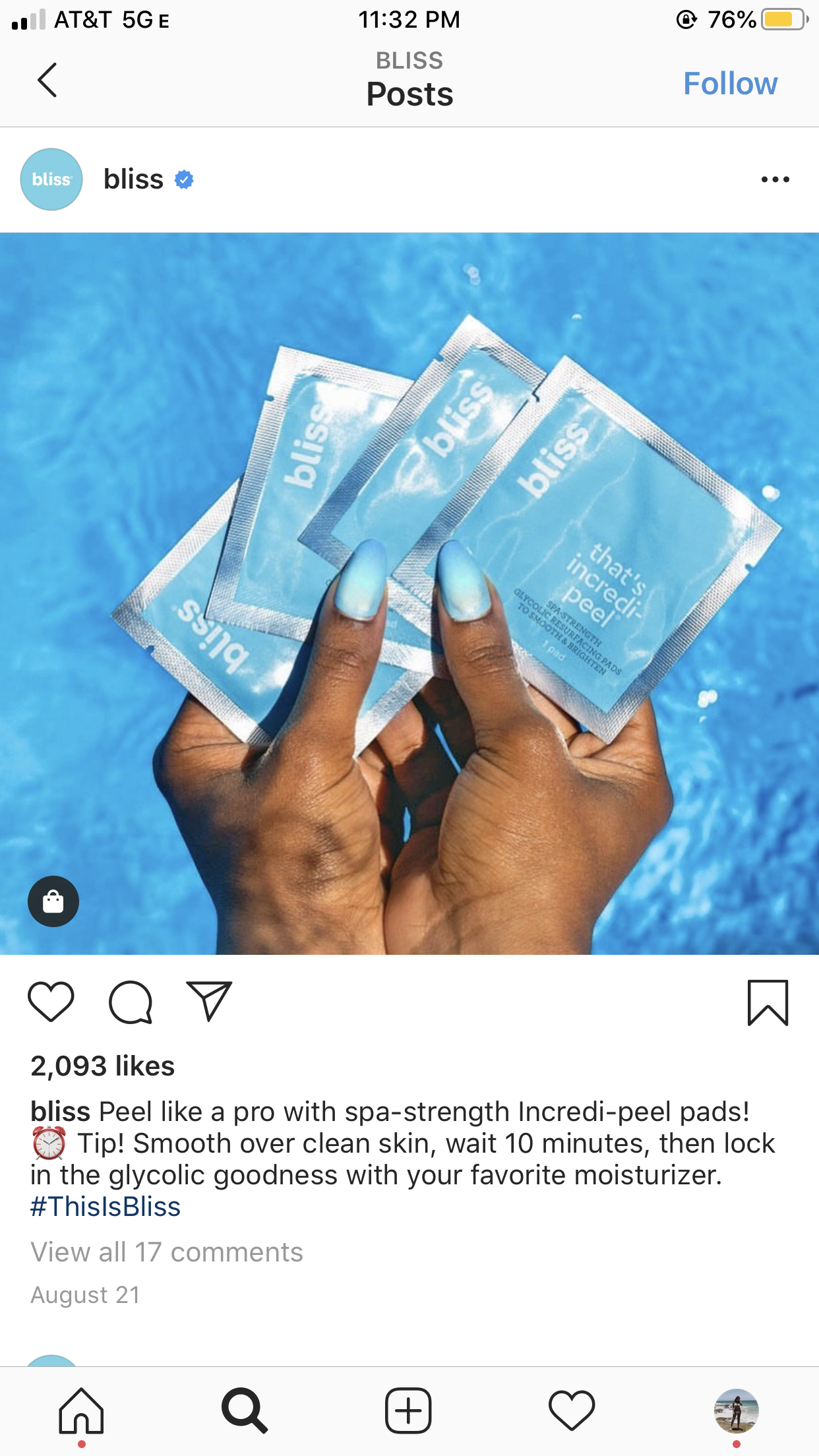
An image is monochromatic when it is only black and white or varying tones of the same color. Monochrome is commonly used in logos for its simple yet artistic effect. We already see monochrome when it comes to the logos of Disney, The New York Times, and Nike. Monochrome gives off a sleek, timeless effect- which might mean it is the design element your business should begin to incorporate in its graphic design. As you can see below, monochrome doesn’t mean boring. Bliss took the monochrome trend a colorful route by sticking to two shades of the same color.
5. Heavy Fonts
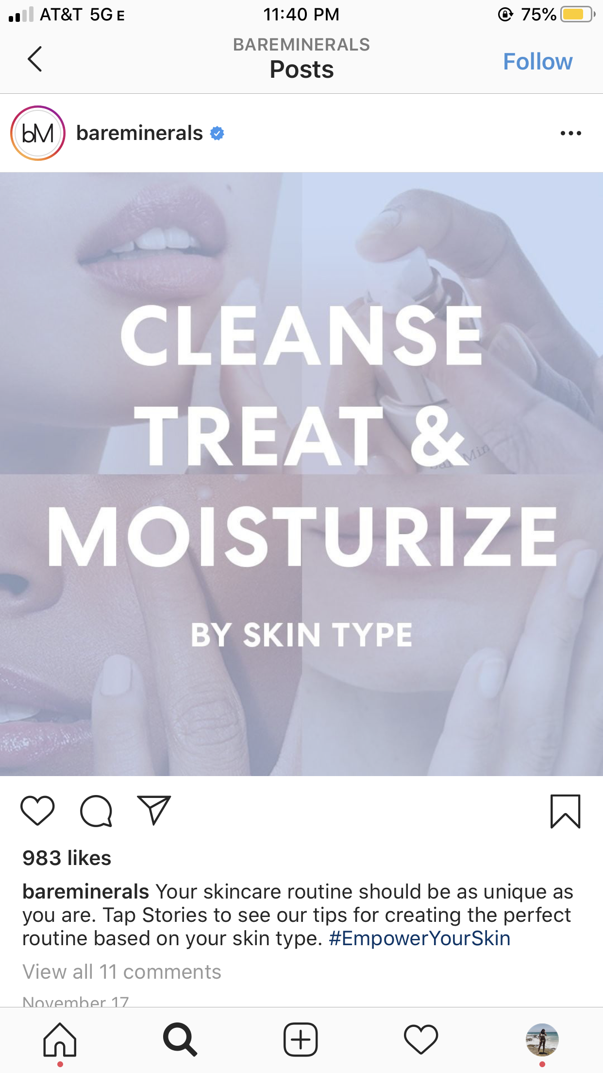
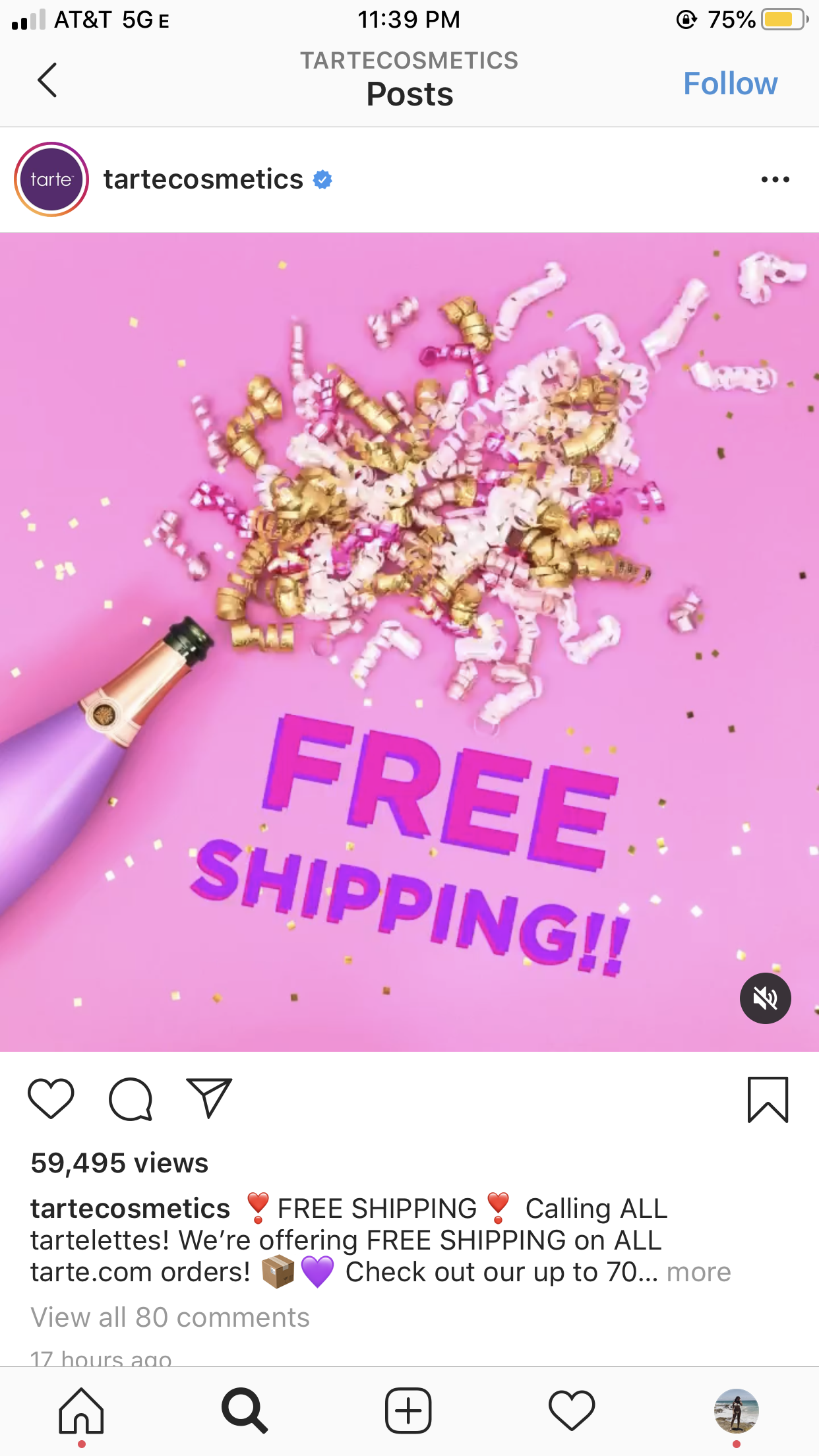
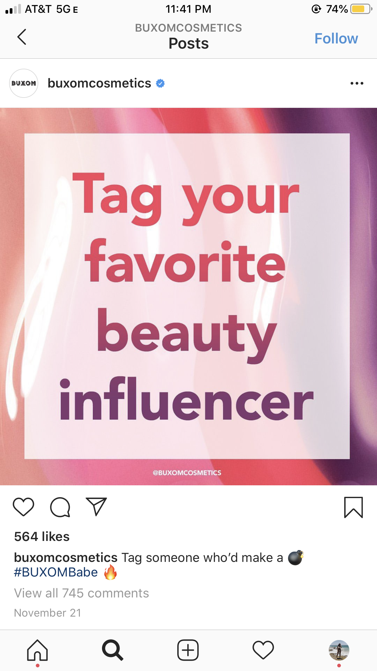
Heavy fonts are the perfect way to get your message across in a bold way. Adding eye-catching fonts to your graphics allow your business to say more than what you are limited to in a caption. Users sometimes scroll through social media and forget to pay attention to the caption, by putting the text over the photo, you are sure to get your message across. Bold colors and strong fonts make for the perfect graphic to stop anyone scrolling through social media in their tracks. The trick with this trend is to make sure you don’t over do it- there is a fine line between eye-catching and overwhelming. Here are some examples of brands that got this trend down right.
2020 seems to be shaping up to be a year full of exciting trends. Are there any you think we forgot? Feel free to contact us.
